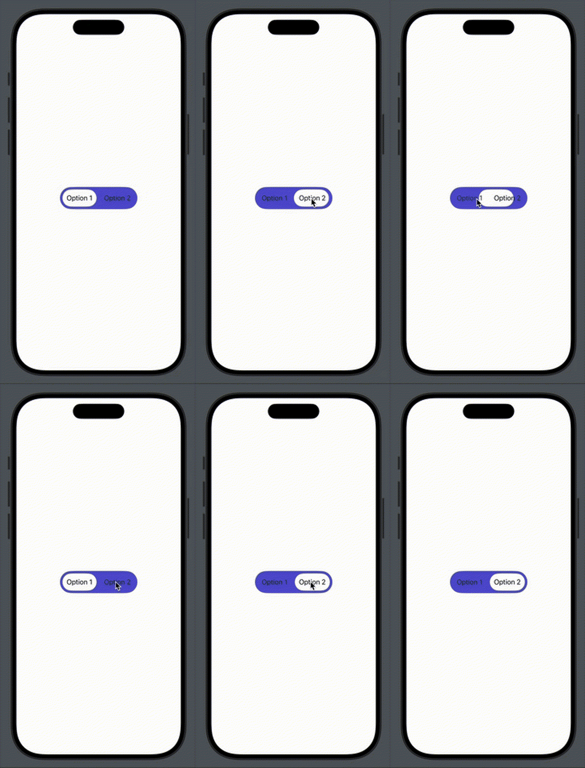
You can download the final code from here: https://gist.github.com/maysamsh/327c77e3f3c98ec29faf026ed5bd143e
A while ago, I stumbled upon this nice segmented control that had a smooth animation when the user switched between options. I assume the author’s intention was to demonstrate how to animate it, not to create a generic component. Since I am working on a personal project-recreating my old Kompressor app from scratch-I decided to use this control instead of the native one provided by Apple. All it needed was a bit of tweaking to make it reusable. In this article, I’ll explain how to make it generic.

In my experience, the best type for a segmented control is an enumeration. It makes the code more readable and easier to maintain Now let’s look at the original code and here you can read the article by Nil :
enum SegmentedControlState: String, CaseIterable, Identifiable {
    var id: Self { self }

    case option1 = "Option 1"
    case option2 = "Option 2"
    case option3 = "Option 3"
}

struct SegmentedControl: View {
    @State private var state: SegmentedControlState = .option1
    @Namespace private var segmentedControl

    var body: some View {
        HStack {
            ForEach(SegmentedControlState.allCases) { state in
                Button {
                    withAnimation {
                        self.state = state
                    }
                } label: {
                    Text(state.rawValue)
                        .padding(10)
                }
                .matchedGeometryEffect(
                    id: state,
                    in: segmentedControl
                )
            }
        }

        .background(
            Capsule()
                .fill(.background.tertiary)
                .matchedGeometryEffect(
                    id: state,
                    in: segmentedControl,
                    isSource: false
                )
        )
        .padding(6)

        .background(.indigo)
        .clipShape(
            Capsule()
        )
        .buttonStyle(.plain)
    }
}
So, all we need to do is modify this code to accept almost any enum instead of the SegmentedControlState provided in the sample code. To achieve this, we need to modify the view to conform to a number of protocols that make it agnostic about the data source it relies on.
Those protocols are: Identifiable, RandomAccessCollection, and optionally Hashable if you wish to save the settings provided by these enums in CoreData or SwiftData. The first two are required because we are using a ForEach block to render the control, which requires its input data to conform to both RandomAccessCollection and Identifiable. I guess Apple chose RandomAccessCollection over BidirectionalCollection for its better performance O(1). Identifiable ensures that each item is unique, which is crucial for maintaining data validity when dynamically updating the items. Then we need to bind the selected item to this view because the view should not know about the data it’s showing.
struct SegmentedControl<T: SegmentedControlType>: View where T: Identifiable, T: Hashable, T.AllCases: RandomAccessCollection {
    @Binding private var selection: T
    @Namespace private var segmentedControl

    init(selection: Binding<T>) {
        self._selection = selection
    }

    var body: some View {
        HStack {
            ForEach(T.allCases) { state in
                Button {
                    withAnimation {
                        selection = state
                    }
                } label: {
                    Text(state.title)
                        .padding(10)
                }
                .matchedGeometryEffect(
                    id: state,
                    in: segmentedControl
                )
            }
        }

        .background(
            Capsule()
                .fill(.background.tertiary)
                .matchedGeometryEffect(
                    id: selection,
                    in: segmentedControl,
                    isSource: false
                )
        )
        .padding(6)

        .background(.indigo)
        .clipShape(
            Capsule()
        )
        .buttonStyle(.plain)
    }
}
Now let’s create a sample enum that could be passed to this new control:
/// A type that provides a title for control
protocol SegmentedControlType: CaseIterable {
    var title: String { get }
}

enum SampleOptions: Identifiable, CustomStringConvertible, SegmentedControlType, Hashable {
    var id: Self { self }

    case option1
    case option2

    var title: String {
        switch self {
        case .option1:
            return "Option 1"
        case .option2:
            return "Option 2"
        }
    }

    var description: String {
        return title
    }
}
CustomStringConvertible is optional, but it helps with debugging. When you print a value of this type, it provides a clean and readable string, such as “Option 1” instead of something like SampleOptions.option1 or option1.
Now, all you need to do is create a state variable in your view or a @Published property in your view model, and pass it to this new control.
/// View
    @State var options: SampleOptions = .option1
    var body: some View {
       SegmentedControl(selection: $dimension)
    }